
Robyn
merry christmas!
 my work had all the fixin's for cookie decorating in the break room today. they're trying really hard to make working during the holidays a not so horrible experience. impossible task, but good effort. anyway i really had fun with the cookies so i thought i'd share them here :)
they had some weird toppings (hence the above breaking bad themed cookie square - hey what was i supposed to do with blue sugar crystals?!)
JOHN LEGEND!
 i just got home from the john legend concert!! oh my gosh oh my gosh oh my gosh! it was so amazing! i had front row tickets, got to watch sound check and get a picture with him! i'm still buzzing from it all! so during the meet and greet we got to take a picture - the instructions said not to bring any gifts but i couldn't help myself. i brought the lyrical poster that i made for the concert last year - and gave it to him (he asked if i had another so that he could sign it for me - heck yes i brought another!!!). oh man there are so many exclamation points in this post but there's just no other way to punctuate these sentences! it was just so amazing - this was like, my 6th concert of his - i really wanted to make it count. mission accomplished :)
coloring book
 |
| bear, medusa, harlequin, victorian |
 |
| they all have the same right side of the face, with a different personality shown on the left. |

Lyrical 2
 i've really been into these lyrical posters. they're a lot of fun (well tedious and time consuming and mind-numbing) but enjoyable! it's a lot of work but i'm really getting in to it! i've done a michael jackson, katy perry, taylor swift and lady gaga. this one i made for my friend who loves t swift (i feel the absolute opposite of that about her). we always joke and argue about it so while making him a cute poster that he can put on the wall, i got my own little dig in there. about an eighth of the way down the poster (during the song love story) is the line "yo, taylor. i'm really happy for you. and i'mma let you finish. but shakespear had one of the best stories of all time." and after that it's the entire play romeo and juliet. ha! i love it.
Lyrical

Fontographer

This was a lot of fun. Initially spurred by a quirk of writing a book with some friends, I decided that I would make typefaces out of their handwriting (to give the book a journaled feel). After I got theirs out of the way (ie my test subjects) I moved on to my own. This became a more daunting and time-consuming task than I thought I set out on. I normally write in all caps but I didn't think this would translate or read well in book form. So I ended up using uppers and lowers. This wasn't good
 |
| cool chart of top typefaces |
The time thing I mentioned earlier was an interesting thing to keep track of. Here's a few ways I measured my time investment in this project:
• TV (that I watched in a small corner of my computer screen): 3 seasons of Breaking Bad
+ 1 season of Sherlock, Luthor and Shameless
• Olympics: 34 gold, 22 silver and 25 bronze medals for team amuricah (U-S-A! U-S-A!)
• Kering pairs (two glyphs manually spaced): 34,486
• Glyphs: 845
graduation present

i'm happy with the results.
Wedding!!!


disney princesses

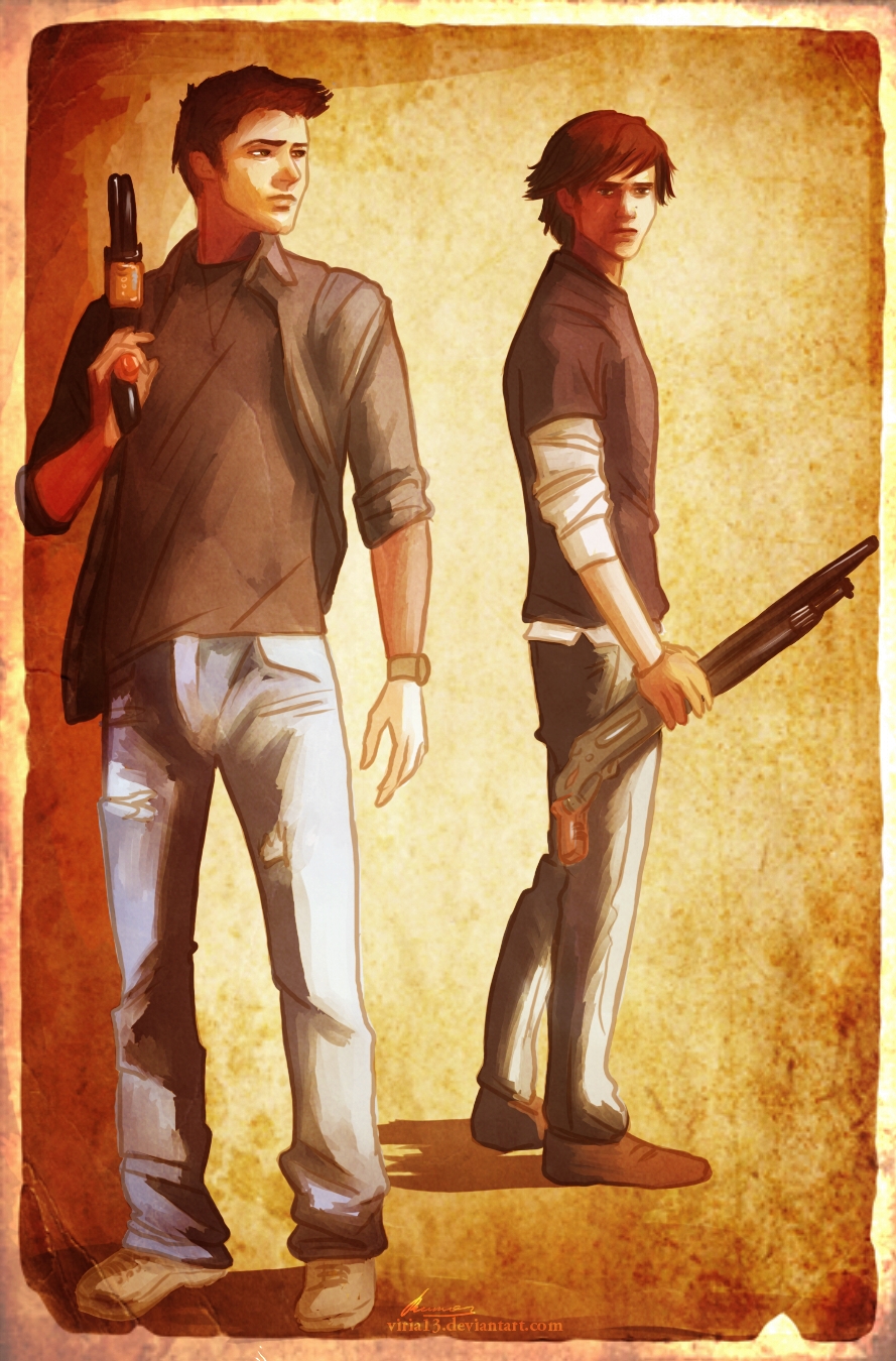
these are amazing!!!! i just had to share. (all this art was done by viria13). besides the awesome princess hipsters there's a drawing of supernatural - one of my favorite shows. this girl is awesome. and only like, 18. talent.

Graduation

i just placed an order for my niece's graduation announcements. the family couldn't decide on which pictures they liked for the back so i did two versions. i tried to keep it very simple and straight-forward, focusing on the pictures to tell the story. luckily justice decided her theme for graduation was colors. all colors. that tied in extremely well with the photos i took of her while she was in sf visiting. so one of those graffiti shots ended up on the front with 4 others gracing the back. i really like the picture of her with the sunglasses - it's young and fun. and since we were unable to use that for her senior pictures i was happy to be able to include it here. on the front i used the typeface whoopass for her name while the rest (including all on the back) is set in metromix.

catering

business

there's about 38 different images on the front, with my contact info on the back. i also added the recycling info (the cards are made of 100% recycled post consumer waste, 100% recyclable and biodegradable, FSC & Smartwood certified paper, and manufactured using wind power) because that's very important to me and the city i currently live in.


Subscribe to:
Comments (Atom)